Typography Revisit

So I now only have 6 weeks left in my very last year. I can hardly believe it, it has been an incredibly difficult journey, always pushing myself to a new level, be it in my personal life or in my design work. Last semester the class spent our entire class in typography focusing in on one main project.

This project consisted of a poster brochure, catalog and some signage. All of these were to promote an art movement in Kingston, put on my our very own modern fuel. The modern art “movement” was called acting out, claim space. http://www.modernfuel.org/art/programming/event/470

I really loved this project yet since it was so large, consisting of a variety of aspects, I have taken it upon myself to revisit it for my last semester choice.

The purpose of this project was to create a unified and quality design among the four different pieces.

The poster brochure needed to consist of a brochure which held the information for the events. once the entire brochure was unfolded there was a poster on the flip side. I have been working on the brochure side a lot, because I felt that my layout was not as effective as it could have been. I put constraints on where the information could be laid in reference to the folds of the brochure, which made it really difficult to find enough space, or give it a nice flow.

Therefore I am now taking all those constraints off, and viewing it as one page, and ignoring the folds.

So far, this is

So far, this is what I have, and I am liking the flow more. But I still have a lot of work to do on it. 🙂

I would still like to add more color to the front and back flap of the brochure, and i am still doing a lot of adjusting for the circle layout.

The Catalog was next, and it consisted of ALOT of type setting. There are some minor tweaks that i have done to the catalog. Nothing major, because I was starting to get a real feel for the project at this point, therefore it ended up being a slightly stronger piece than the poster and signage.

I have only posted a few photos of the catalog, since it was 36 pages. 🙂

Screenshot 2015-03-10 21.43.41 Screenshot 2015-03-10 21.43.38 Screenshot 2015-03-10 21.43.34

I changed the table of contents a little.

I changed the table of contents a little.

This used to be the old cover

This used to be the old cover

New cover

New cover

last but not least, I have my signage, this had to contain one of the artists information, and you would find this at the site of the event to help people find the exact location.

old signage

old signage

I am still working alot on this one. This one was very rushed at the end of last semester, and I feel having this looking tip top would really tie this whole project together nicely. After tweaking for hours on the other two items, and I am now hitting this one full throttle.

Here is what I have so far!

new poster signage.

new poster signage.

I have a lot of hierarchy to work on here still, and some color, but all in all I am really liking this alot better already!

till next time!

Illustration child story Revisits 2015

I have learned so much about design and my own style of design over the past year. I am now in my last semester of school and I am revisiting some older projects, one of them being an illustration project.

The purpose of this project was to illustrate a cover and a full spread of a favourite childrens story. I love goodnight moon by Margaret Wise Brown, so the story was an easy choice.

Original i cover by  Clement Hurd

Original cover by Clement Hurd

Here is a sample of my illustrations for the book,

Cover and Spread Illustration design by Jessica Mayer

Cover and Spread Illustration design by Jessica Mayer

Screenshot 2015-02-06 17.07.04

Unfortunately I do not believe I did the story justice with my illustration design. At the time I was trying to heighten my skills in photoshop and took a completely digital approach to the design. I personally do not feel that the style speaks for the rest of my portfolio work, or my own personal taste.

I feel that the typography is not very interesting in the spread, and since it is a childrens book and will most likely be read by children, I feel the type should stand out and by easier to read. I also want a hand drawn feel to the illustrations, so I will be drawing/painting them, and then scanning the illustration in.

I enjoy the depth in the illustrations I did for my first version of the book, but I also want them to feel more inviting.

Here are some illustration styles that I really like from Pinterest,

834ee02703b7e8057b33442441a4eef0 cf83c02bbfa6caff9793917203287d1f fd06c1d7fc296cde0d131d774381c6cb 38e431e60b6afdf061e7b11e5d919eb5 d21f0045ba1a621bef4d173bbabcdfee

I love the color palette for this, very soft and inviting

I love the color palette for this, very soft and inviting

This one mirrors mine the most, I also love it. If I do choose to stay with the darker colors, then I would like to go for a cuter more child-like feel.

This one mirrors mine the most, I also love it. If I do choose to stay with the darker colors, then I would like to go for a cuter more child-like feel.

Lately I have been experimenting with different media, styles, and colors and just having fun drawing and scribbling out drawing after drawing. I get quite nervous showing my illustrations but I have posted some that I find fun, and cute.

A little mouse, original and the other has been slightly photoshopped

A little mouse, original and the other has been slightly photoshopped

illustration_spot

illustration_cover

I need to add more contrast to my illustrations. I have redo this one about 6 times and it still needs more depth. I am using cream crayons, its alot of fun!

I need to add more contrast to my illustrations. I have redo this one about 6 times and it still needs more depth. I am using cream crayons, its alot of fun!

Visual Hierarchy

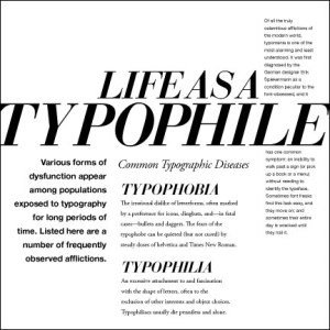
typophilecomp4

Today I went to burger joint with my boyfriend. We sat down, got our menus, and started looking them over. He had been to this particular place multiple times before, and always ordered the same item on the menu. I was a newbie, and I did not understand how their ordering system worked. You basically had to build your own burger, but as I continued to glance at the menu I found it abundantly clear how unclear this menu really was. After roughly 15 minutes of very confusing navigation, I finally found what I wanted to order. Eventually the real issue dawned on me.

Thanks to type and visual hierarchy, looking at a menu, poster or even a letter, our eye can quickly navigate where it needs to go to, and what steps come first. But if the designer strays too far away from type layout, we can find ourselves confused and lost. In this particular case with the menu I found that the style and design of the menu was eye catching and very well done, but within that hierarchy was completely lost.

So if we want our design to look amazing, but we need to keep hierarchy, how do we do that?

Well here are some basic steps to maintaining type/visual hierarchy in your designs.

Step number Uno is usually size and placement. Size does matter! Our eye will automatically read the largest type on the page, even if it is not at the top. We will jump back up tot he top if we have to.

hierarchy1

Here are a few percentages to help you get started:

Main body copy (14 points)
Main headers: 250 percent more than main body copy (35 points)
Secondary headers: 175 percent more than main body copy (25 points)
Navigation elements: 165 percent more than main body copy (23 points)
Secondary navigation or menus: 140 percent more than main body copy (20 points)

*A little tip for when you are choosing your typeface, is too choose one that has a lot of different weights to it. Because this is your next important step for type hierarchy.

Weight comes next, it seems obvious that a thicker stronger font will draw more attention than a thin font, even if the thin font is larger. but this is not necessarily the case, placing a bold font next to the same font size, it will stand out more, mainly because it draws more attention.

paramore

The last step is a fun one, and the is COLOR! Yes adding or changing color will obviously make certain parts of your text stand out more than the rest. And remember, cooler colors, such as greys and blues, might sink back more, while warm colors tend to pop off the page and draw the reader in.

graphic-fixed

I hope these few tidbits have helped in some way. There are many ways to add hierarchy, and there are not strict rules about it. Just remember it is important, you do not want your audience feeling frustrated when trying to view your type.

I studied the wrong degree! – Thoughts during college.

Life-After-Graduation_MSWatUSC

After 100’s of hours of designing and class, and lectures, I find myself in my second last semester. I have one more to go! This is a very scary yet exciting place to find myself in. And Although the journey of college is finished for a good percent of my class, I do not find myself in that same place.

End of my second year I found myself not enjoying design, from the smallest seams which hold design together to the large sheets of fabric that make up what design is all about. I just couldn’t stand any of it, this scared me, and i considered dropping out. But then I looked at it from a different perspective. I could finish my degree, and spend the next year and a bit to really think about where I want to take my education/career.

And that is exactly what I did. I am not done mulling these thoughts over, or discovering what might be out there. It is very scary to now be considering what second educational path I want to take next fall. I am three years older and do not want to mess up again.

So my first step was to talk to some adults, ei. my parents, my fiances parents, my professors and my counselor. I have come to find out it is rather common for people to regret what they studied in Uni, I have also found it common for people to go through with finishing their degree and either working in a completely different field or going back to school for another round of schooling.

My next step was to admit this out loud, that I did not like what I was studying, that I did not want a career in it, and that I am completely dumbfounded about what to do next, and there is an obvious fear and pressure to make the correct choice this time!

My current step, is a difficult one, where I am currently still finishing my graphic design degree yet I am putting a lot of focus on what I want to study next fall. I do not want to rush into this, but I feel the end of my third year bearing down on me, and its feeling a tad bit terrifying.

In conclusion, this blog might not be about graphic design, but it might be about a more important subject, life design. I am doing my best to design a life for myself, and my family. Do i regret ever studying graphic design? No, not quite. I wish I hadn’t put three years of my young life into it, but I learned so much about myself, that you can’t fully put a price on it. I believe it has set me up for choosing the perfect career/education for myself.

I hope this has spoken to someone who might be feeling squeamish, either with graduation baring down on them, or feeling insecure about a choice you have made.

Here is a fun buzzfeed video, on a slightly different but related note, ENJOY!

Till next time

Time Management Skills

Being a manager of your own time can be grueling and difficult. I for one am terrible at managing time, projects and deadlines. This is not a good place to find yourself in when you are in school, it is better to nip it in the “behind” than to let it stalk you into your career.

Here are a few strategies I plan on using in my future to help myself stay on top of my life,

Get enough sleep: This one might sound either too easy or that it might have the opposite effect on getting projects done on time. Personally I fall apart without sleep, I get sick, grumpy, sluggish, and foggy. These are all bad team mates to have when you need to focus and “get’er done”. So be kind and unwind with some sleep.

Cut it into bite sizes: Sometimes I find myself writing HUGE to-do list for one day. It become depressing when you suddenly realize how long this will all take you to finish. Feeling depressed makes me want to get out, watch tv, sleep excessively, shop online… basically anything that is not on my to-do list. So instead I now try to do little bits, this seems a lot less frightening and won’t require the heimlich maneuver.

Do it when you’re in the mood: Not what you think, sadly. But don’t try to work on projects, work, etc, when you are not at your best. Personally evening, sometimes night time seems to work best for me. I am as slow as a sloth til about noon, so it has become quite futile to even attempt being productive in the AM. So find when you feel most alert and mentally focused. I even find that depending on my mood, I might need complete silence to work, or I might need music/movies running in the background.

I do believe it might take me years to figure this all out, how to be productive and not feel like it is killing me by the second. But hopefully every semester I will have grown just a little bit more.

til next time!
Its not the end

ImageOver the past few months I have been keeping this blog, and if you read back to my first few posts I was rather resentful to be forced to write to the public. But over these cold winter months I have begun to enjoy putting ideas together, slapping a title on it and allowing anyone to read it if they chose to. One thing I have learned is that trying new things is a good thing, even to just say that “I’ve done that”. So perhaps I won’t keep with up the design blogging once the busy summer comes rolling around but I can see myself blogging about more personal things, subjects which might really help people and of course, with a designer-y twist.

But I would like to reflect a little on why do we design? Do you design or create? and why do you? I have thought about this a lot and I will continue to. But I started designing because I wanted to express myself in ways that could make people feel happy about what they see when I am done. So whenever you feel insecure about a design you are working on or have self doubts, remind yourself of why you love design in the first place.

“The ability to simplify means to eliminate the unnecessary so that the necessary may speak.” – Hans Hoffman


photo Source: http://designyoutrust.com/2013/02/3-former-design-trends-that-arent-cool-anymore-so-stop-using-them-medianovak/

RGD Event

Image


RGD (registered graphic designers of Ontario) is a place for designers to meet, share knowledge, and, promote continuous learning. They do this through many different medias, webinars, events, articles, etc. I decided to take advantage of this great opportunity to hear from designers, that have great experience and advice for a newbie like myself.

I decided to watch one of the posted panel videos about “how creative people arrive at ideas”. This really peaked my interest because I want to have really bright ideas for my designs, so therefore I am desperate to know how the pros do it!

I really liked the experience I had watching the video, I enjoyed listening to the five people who sat on the panel. They were asked questions from audience members or other panel members and gave very insightful answers. It was also enjoyable being able to watch from the comfort of my apartment. Real people attended the seminar live, but it was a great experience being able to watch what they had recorded. A small part of me wishes I could have been there to ask some questions which I had on my mind. 

One thing I learned and really enjoyed hearing about was how the member on the panel brainstorm. Everyone on the panel stated that the best way to brainstorm is throwing ideas out verbally and writing it all down. They also said that when you are brainstorming alone or in a group, be aware of your surrounding, what food are you eating, music, noise, etc. all of these things can greatly affect your mental readiness for brainstorming. I really enjoyed listening to people with a variety of experiences give their different inputs to the same questions. I will definitely be watching more webinars. its even great to have on as I am working on a design project, who knows, it might spark an idea. I will definitely be watching more of these videos, especially when I have a brain block and perhaps i will really take advantage of RGD and join live web feeds, I hope to see you designers there!

Go ahead and give this short video from RGD a try!

Real World Advice from the pros

peanuts-blogging-advice-770x433

We have been given advice and instruction our whole lives. Now most of you reading this blog are grown up, maybe attending college, or about to graduate and find a “real job”. All of this is terrifying and exciting at the same time, and one thing we all have in common is we want to be a big success. 

I went surfing on the web to find some good advice given from people who have had more experience than you and I perhaps, and I wanted to share it.

Lesson #1

Connecting, 1,2,3.

One piece of advice I have seen almost everywhere, on every design blog is to connect, connect to people in your field or line of work.

Make friends, partners, connections, let people know who you are and be friendly. Have a large pool of people who are in the design world (be it fashion, architect, graphic design, etc.) One day you will need advice, or a job, or someone to work with. I believe this is so important for designers, where most of our final work is put together with design teams, and collaboration. We also need designers or similar people to talk to and blow off steam, people who “get” us.

Lesson # 2

Never explain your designs before revealing them.

I found this advice surprising at first, but then Preston http://www.graphicdesignblender.com/, began to explain his reasons, and they make perfect sense. Here is what I got out of it.

Basically if you have to explain all your reasons and thoughts behind a design, then maybe it is not as strong as you has hoped. The best is to reveal the design and wait and watch for the reaction of the client. It is the moment of truth, especially when your client understands your design without your explanation. When it is revealed to the public, you will not have the opportunity to explain it to them, so you better hope you got it right. Once you have shown your client your design and gotten their feed back, give them your rational about all the whys, and hows of your design process.

Lesson # 3

Have a big portfolio, not a big ego!

The final big piece of advice goes hand in hand with pride! Employers do not hire you because you say you are the best or act like you and your portfolio are “hot stuff”. They get tons of calls and emails a week from very talented people, so do not act like you are above everyone else, but instead show your potential employers that you know how to work hard and get stuff done. Don’t act like you are above getting your hands dirty simply because you have a large portfolio.I believe this is such important advice, since there is nothing more tragic than a talented person who has too much ego for their own good. Employers pick up on this and it usually comes across as you are too good to work hard. This is not the same as confidence, it is a fine line and it might take a few interviews to get it right. A small piece of advice that I was given a few years back was to practise your interview with someone you respect, they can always critique you before you try it out for real.

I hope this will help you get a little more prepared for wherever you are in life, and please add any advice you feel is important in the comments. Here is a short video of a designer being asked about what his advice would be.

Till Next time!

Sources

http://www.graphicdesignblender.com/why-i-never-explain-my-designs-before-revealing-them-to-my-client

Advice For Design Students

Reflection Time…

Image

I was assigned a group project a few weeks ago, where we had to find an area in my school that did not offer their services with ease of accessibility to the average student and especially to the extreme user such as (a blind, deaf, or a student with mental illness). We chose to investigate our student association, also known as the SA.

It resides on the second floor of the college, its a few thousand square feet, its a large space, divided into board rooms, study areas, a large computer lab, games room, and the office of the student associators. But after some student polls, and research into what the SA provides, we realized that most students do not know about all of these services and more, such as,

– school food bank

– legal services

– rideshare program

– chaplain 

and percents off of at certain stores!

After all our research and time placed into constructing a presentation, I learned a couple of new things especially about group work. One being that in order to work great as a group you need to get to know each other, so sometimes just talking and laughing made the group tighter knit, and we worked better together. I also learned that in the end everything comes together somehow, no matter what time retrains or personal ones there might be.

We did some reasearch, one being an online student poll, another was an email interview with an administrator in the accessibility department, and an interview with the president of the SA. I personally found that hearing from the students themselves was the most successful. Students are the audience which the SA is trying to reach, therefore I believe their opinion is the most important and should be seriously listened to. The least useful research may have been the advice of the administrator in the accessibility department, not because he was not knowledgable. but because his answers varied greatly from the students. So it made me think that somewhere along the line there was a missing link, or broken communication on what students need, and, want. 

In the end I was very surprised about the needs of the extreme user, such needs being having an accessible website, where they can scan through with voice overlay. I never knew that website could be formatted for the blind to use. I think this is a really wonderful idea and a responsible approach. 

FINALLY! I really want to hear what my readers think needs to be made more accessible in your community? Either to an everyday user or an extreme user. Post your thoughts!

Till next time!